Flutter验证码输入框的2种方法实现
本文主要介绍了Flutter验证码输入框的2种方法实现,文中通过示例代码介绍的非常详细,具有一定的参考价值,感兴趣的小伙伴们可以参考一下
目录
重点是什么?
从头开始制作 OTP 字段
使用第三个包
结论
本文向您展示了在 Flutter 中实现完美的验证码输入框几种不同方法。
重点是什么?
真实世界的 完美的验证码输入框或 PIN 输入 UI 通常满足以下最低要求:
有4个或6个文本域,每个文本域只能接受1个字符(通常是一个数字)
输入数字后自动聚焦下一个字段
您经常在需要电话号码确认、电子邮件或双因素身份验证的应用程序中看到此功能。
从头开始制作 OTP 字段
应用预览
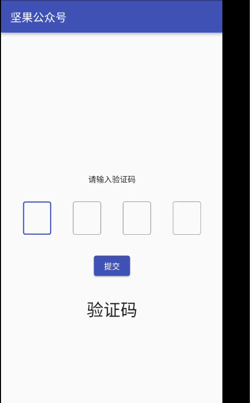
此示例创建一个简单的 OTP 屏幕。首先,聚焦第一个输入字段。当您输入一个数字时,光标将自动移动到下一个字段。当按下提交按钮时,您输入的 OTP 代码将显示在屏幕上。
以下是它的工作原理:
测试此应用程序时,您应该使用模拟器的软键盘而不是计算机的硬件键盘。
代码
创建一个名为OtpInput的可重用小部件:
1 2 3 4 5 6 7 8 9 10 11 12 13 14 15 16 17 18 19 20 21 22 23 24 25 26 27 28 29 30 31 | // Create an input widget that takes only one digitclass OtpInput extends StatelessWidget { final TextEditingController controller; final bool autoFocus; const OtpInput(this.controller, this.autoFocus, {Key? key}) : super(key: key); @override Widget build(BuildContext context) { return SizedBox( height: 60, width: 50, child: TextField( autofocus: autoFocus, textAlign: TextAlign.center, keyboardType: TextInputType.number, controller: controller, maxLength: 1, cursorColor: Theme.of(context).primaryColor, decoration: const InputDecoration( border: OutlineInputBorder(), counterText: '', hintStyle: TextStyle(color: Colors.black, fontSize: 20.0)), onChanged: (value) { if (value.length == 1) { FocusScope.of(context).nextFocus(); } }, ), ); }} |
main.dart 中的完整源代码和解释(我将OtpInput类放在文件底部):
1 2 3 4 5 6 7 8 9 10 11 12 13 14 15 16 17 18 19 20 21 22 23 24 25 26 27 28 29 30 31 32 33 34 35 36 37 38 39 40 41 42 43 44 45 46 47 48 49 50 51 52 53 54 55 56 57 58 59 60 61 62 63 64 65 66 67 68 69 70 71 72 73 74 75 76 77 78 79 80 81 82 83 84 85 86 87 88 89 90 91 92 93 94 95 96 97 98 99 100 101 102 103 104 105 106 107 108 109 110 111 112 113 114 115 116 117 118 119 120 121 122 123 124 125 126 127 128 129 130 131 132 | import 'dart:math' as math;import 'package:flutter/cupertino.dart';import 'package:flutter/material.dart';import 'package:async/async.dart';import 'package:flutter/scheduler.dart';import 'package:url_strategy/url_strategy.dart';void main() { setPathUrlStrategy(); runApp(MyApp());}class MyApp extends StatelessWidget { const MyApp({Key? key}) : super(key: key); @override Widget build(BuildContext context) { return MaterialApp( // Hide the debug banner debugShowCheckedModeBanner: false, title: '坚果', theme: ThemeData( primarySwatch: Colors.indigo, ), home: const HomeScreen(), ); }}class HomeScreen extends StatefulWidget { const HomeScreen({Key? key}) : super(key: key); @override State<HomeScreen> createState() => _HomeScreenState();}class _HomeScreenState extends State<HomeScreen> { String _imageUrl = 'https://luckly007.oss-cn-beijing.aliyuncs.com/image/image-20211124085239175.png'; double _fontSize = 20; String _title = "坚果公众号"; // 4 text editing controllers that associate with the 4 input fields final TextEditingController _fieldOne = TextEditingController(); final TextEditingController _fieldTwo = TextEditingController(); final TextEditingController _fieldThree = TextEditingController(); final TextEditingController _fieldFour = TextEditingController(); // This is the entered code // It will be displayed in a Text widget String? _otp; @override Widget build(BuildContext context) { return Scaffold( appBar: AppBar( title: Text(_title), ), body: Column( mainAxisAlignment: MainAxisAlignment.center, children: [ const Text('请输入验证码'), const SizedBox( height: 30, ), // Implement 4 input fields Row( mainAxisAlignment: MainAxisAlignment.spaceEvenly, children: [ OtpInput(_fieldOne, true), OtpInput(_fieldTwo, false), OtpInput(_fieldThree, false), OtpInput(_fieldFour, false) ], ), const SizedBox( height: 30, ), ElevatedButton( onPressed: () { setState(() { _otp = _fieldOne.text + _fieldTwo.text + _fieldThree.text + _fieldFour.text; }); }, child: const Text('提交')), const SizedBox( height: 30, ), // Display the entered OTP code Text( _otp ?? '验证码', style: const TextStyle(fontSize: 30), ) ], ), ); }}// Create an input widget that takes only one digitclass OtpInput extends StatelessWidget { final TextEditingController controller; final bool autoFocus; const OtpInput(this.controller, this.autoFocus, {Key? key}) : super(key: key); @override Widget build(BuildContext context) { return SizedBox( height: 60, width: 50, child: TextField( autofocus: autoFocus, textAlign: TextAlign.center, keyboardType: TextInputType.number, controller: controller, maxLength: 1, cursorColor: Theme.of(context).primaryColor, decoration: const InputDecoration( border: OutlineInputBorder(), counterText: '', hintStyle: TextStyle(color: Colors.black, fontSize: 20.0)), onChanged: (value) { if (value.length == 1) { FocusScope.of(context).nextFocus(); } }, ), ); }} |
使用第三个包
为了仅用几行代码快速实现您的目标,您可以使用第三方插件。在我们的例子中一些好的是pin_code_fields,otp_text_field等。 下面的例子将使用pin_code_fileds,它提供了很多很棒的功能:
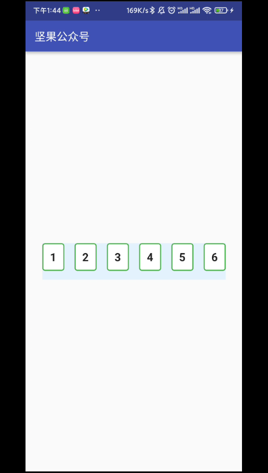
自动将下一个字段集中在打字上,将上一个字段集中在委派上
可以设置为任意长度
高度可定制
输入文本的 3 种不同类型的动画
动画活动、非活动、选定和禁用字段颜色切换
自动对焦选项
从剪贴板粘贴 OTP 代码
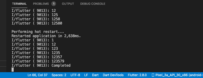
您还可以在终端窗口中看到您输入的字符:
代码
1.安装插件:
1 | flutter pub add pin_code_fields |
2.最终代码:
1 2 3 4 5 6 7 8 9 10 11 12 13 14 15 16 17 18 19 20 21 22 23 24 25 26 27 28 29 30 31 32 33 34 35 36 37 38 39 40 41 42 43 44 45 46 47 48 49 50 51 52 53 54 55 56 57 58 59 60 61 62 63 64 65 66 67 68 69 70 71 72 73 74 75 76 77 78 79 80 81 82 83 84 85 86 87 88 | import 'dart:math' as math;import 'package:flutter/cupertino.dart';import 'package:flutter/material.dart';import 'package:async/async.dart';import 'package:pin_code_fields/pin_code_fields.dart';import 'package:url_strategy/url_strategy.dart';void main() { setPathUrlStrategy(); runApp(MyApp());}class MyApp extends StatelessWidget { const MyApp({Key? key}) : super(key: key); @override Widget build(BuildContext context) { return MaterialApp( // Hide the debug banner debugShowCheckedModeBanner: false, title: '坚果', theme: ThemeData( primarySwatch: Colors.indigo, ), home: const HomeScreen(), ); }}class HomeScreen extends StatefulWidget { const HomeScreen({Key? key}) : super(key: key); @override State<HomeScreen> createState() => _HomeScreenState();}class _HomeScreenState extends State<HomeScreen> { String _imageUrl = 'https://luckly007.oss-cn-beijing.aliyuncs.com/image/image-20211124085239175.png'; double _fontSize = 20; String _title = "坚果公众号"; // 4 text editing controllers that associate with the 4 input fields TextEditingController textEditingController = TextEditingController(); String currentText = ""; @override Widget build(BuildContext context) { return Scaffold( appBar: AppBar( title: Text(_title), ), body: Padding( padding: const EdgeInsets.all(30), child: Center( child: PinCodeTextField( length: 6, obscureText: false, animationType: AnimationType.fade, pinTheme: PinTheme( shape: PinCodeFieldShape.box, borderRadius: BorderRadius.circular(5), fieldHeight: 50, fieldWidth: 40, activeFillColor: Colors.white, ), animationDuration: const Duration(milliseconds: 300), backgroundColor: Colors.blue.shade50, enableActiveFill: true, controller: textEditingController, onCompleted: (v) { debugPrint("Completed"); }, onChanged: (value) { debugPrint(value); setState(() { currentText = value; }); }, beforeTextPaste: (text) { return true; }, appContext: context, ), ), ), ); }} |
结论
我们已经介绍了 2 个在 Flutter 中创建现代优雅的 完美的验证码输入框/PIN 输入字段的示例。
到此这篇关于Flutter验证码输入框的2种方法实现的文章就介绍到这了
原文链接:https://blog.csdn.net/qq_39132095/article/details/122120384