
Python pyecharts绘制条形图详解
pyecharts是一个由百度开源的数据可视化,凭借着良好的交互性,精巧的图表设计,得到了众多开发者的认可。本文将利用其绘制多样的条形图,需要的可以参考一下
目录
一、简介
二、整理数据
1、配置主题
2、柱状图 Bar - Bar_base_dict_config
3、样例数据 Faker.choose()
4、滚动条 Bar - Bar_datazoom_slider
5、鼠标移动效果 Bar - Bar_datazoom_inside
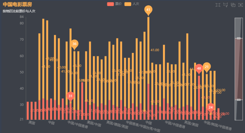
6、显示最值 Bar - Bar_markpoint_type
7、改变滚动条在侧面 Bar - Bar_datazoom_slider_vertical
8、多个Y轴
9、直方图 Bar - Bar_histogram
一、简介
关于具体详情,请咨询:pyecharts官网
pyecharts是一个由百度开源的数据可视化,凭借着良好的交互性,精巧的图表设计,得到了众多开发者的认可。而Python 是一门富有表达力的语言,很适合用于数据处理。当数据分析遇上数据可视化时,pyecharts诞生了。Echarts是用JS来写的,而我们使用pyecharts则可以使用Python来调用里面的API。
优点:
简洁的 API 设计,使用如丝滑般流畅,支持链式调用
囊括了 30+ 种常见图表,应有尽有
支持主流 Notebook环境,Jupyter Notebook 和 JupyterLab
可轻松集成至 Flask,Django 等主流 Web 框架
高度灵活的配置项,可轻松搭配出精美的图表
详细的文档和示例,帮助开发者更快的上手项目
多达 400+地图文件以及原生的百度地图,为地理数据可视化提供强有力的支持。
二、整理数据
安装:
1 | pip install pyecharts |
1、配置主题
1 2 | Bar(init_opts=opts.InitOpts(theme=ThemeType.LIGHT)) # 第一种Bar({"theme": ThemeType.MACARONS}) # 第二种 |

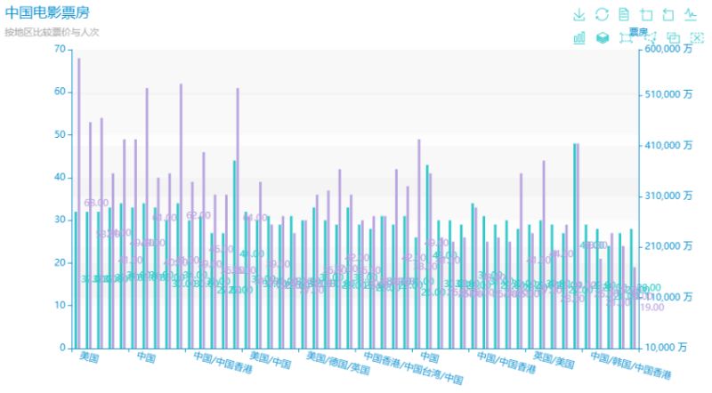
2、柱状图 Bar - Bar_base_dict_config
1 2 3 4 5 6 7 8 9 10 11 12 13 14 15 16 17 18 19 20 21 22 23 24 25 26 27 28 29 30 31 | import osfrom matplotlib import pyplot as plt from pyecharts import options as optsfrom pyecharts.charts import Barfrom pyecharts.commons.utils import JsCodefrom pyecharts.globals import ThemeTypelist1=cnbodfsort['REGION'].tolist()list2=cnbodfsort['PRICE'].tolist()list3=cnbodfsort['PERSONS'].tolist()c = ( Bar(init_opts=opts.InitOpts(theme=ThemeType.LIGHT)) .add_xaxis(list1) .add_yaxis("票价", list2, stack="stack1", category_gap="50%") .add_yaxis("人次", list3, stack="stack1",category_gap="50%") .set_series_opts( label_opts=opts.LabelOpts( position="right", formatter=JsCode( "function(x){return Number(x.data).toFixed(2);}" ), ) ) .set_global_opts( xaxis_opts=opts.AxisOpts(axislabel_opts=opts.LabelOpts(rotate=-15)), title_opts=opts.TitleOpts(title='中国电影票房',subtitle='按地区比较票价与人次') ))# c.render("cnbo1.html") # 生成html图片# os.system("cnbo01.html") # 执行完代码直接跳出来图片c.render_notebook() # 直接在代码区域展示图片 |
3、样例数据 Faker.choose()
使用这段代码会随机调用系统的样例参数:
1 | .add_xaxis(Faker.choose()) |
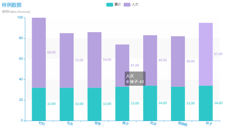
1 2 3 4 5 6 7 8 9 10 11 12 13 14 15 16 17 18 19 20 21 22 23 24 25 26 27 | from pyecharts.faker import Fakerlist1=cnbodfsort['REGION'].tolist()list2=cnbodfsort['PRICE'].tolist()list3=cnbodfsort['PERSONS'].tolist()c = ( Bar({"theme": ThemeType.MACARONS}) ### 配置好看的图表主题!!! .add_xaxis(Faker.choose()) ### 这句话表示使用随机的后台样例数据 .add_yaxis("票价", list2, stack="stack1", category_gap="50%") .add_yaxis("人次", list3, stack="stack1",category_gap="50%") .set_series_opts( label_opts=opts.LabelOpts( position="right", formatter=JsCode( "function(x){return Number(x.data).toFixed(2);}" ), ) ) .set_global_opts( xaxis_opts=opts.AxisOpts(axislabel_opts=opts.LabelOpts(rotate=-15)), title_opts={"text":"样例数据","subtext":"使用Faker.choose()"} ))c.render("cnbo1.html") # 生成html图片# os.system("cnbo1.html") # 执行完代码直接跳出来图片c.render_notebook() # 直接在代码区域展示图片 |
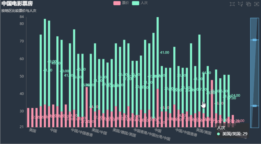
4、滚动条 Bar - Bar_datazoom_slider
1 | datazoom_opts=opts.DataZoomOpts() |
表示可以滑动的滚动条:
1 2 3 4 5 6 7 8 9 10 11 12 13 14 15 16 17 18 19 20 21 22 23 24 25 26 27 | list1=cnbodfsort['REGION'].tolist()list2=cnbodfsort['PRICE'].tolist()list3=cnbodfsort['PERSONS'].tolist()c = ( Bar(init_opts=opts.InitOpts(theme=ThemeType.LIGHT)) .add_xaxis(list1) .add_yaxis("票价", list2, stack="stack1", category_gap="50%") .add_yaxis("人次", list3, stack="stack1",category_gap="50%") .set_series_opts( label_opts=opts.LabelOpts( position="right", formatter=JsCode( "function(x){return Number(x.data).toFixed(2);}" ), ) ) .set_global_opts( xaxis_opts=opts.AxisOpts(axislabel_opts=opts.LabelOpts(rotate=-15)), title_opts=opts.TitleOpts(title='中国电影票房',subtitle='按地区比较票价与人次'), brush_opts=opts.BrushOpts() ,### 使用这个可以使图片的右上角多出来一些工具 datazoom_opts=opts.DataZoomOpts(), ### 可以使最下面多出滚动条 ))c.render("cnbo2.html") # 生成html图片# os.system("cnbo01.html") # 执行完代码直接跳出来图片c.render_notebook() # 直接在代码区域展示图片 |

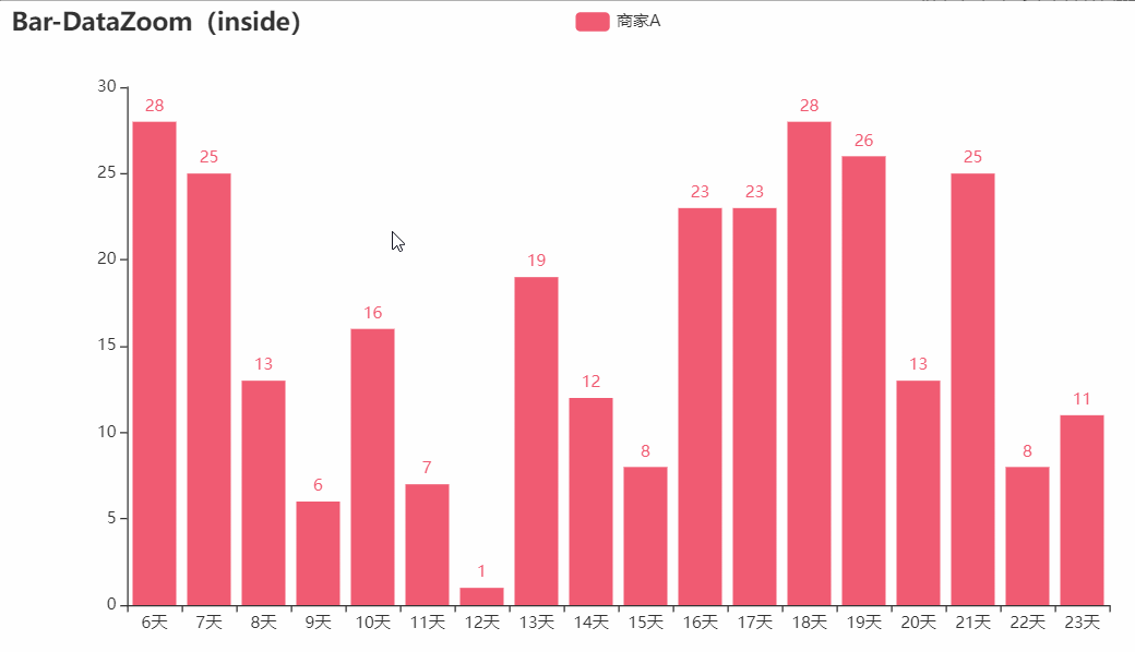
5、鼠标移动效果 Bar - Bar_datazoom_inside
根据鼠标来放大与缩小的效果:
1 2 3 4 5 6 7 8 9 10 11 12 13 14 | from pyecharts import options as optsfrom pyecharts.charts import Barfrom pyecharts.faker import Fakerc = ( Bar() .add_xaxis(Faker.days_attrs) .add_yaxis("商家A", Faker.days_values, color=Faker.rand_color()) .set_global_opts( title_opts=opts.TitleOpts(title="Bar-DataZoom(inside)"), datazoom_opts=opts.DataZoomOpts(type_="inside"), ) .render("bar_datazoom_inside.html")) |
6、显示最值 Bar - Bar_markpoint_type
1 2 3 4 5 6 7 8 9 10 11 12 13 14 15 16 17 18 19 20 21 22 23 24 25 26 27 28 29 30 31 32 33 34 | list1=cnbodfsort['REGION'].tolist()list2=cnbodfsort['PRICE'].tolist()list3=cnbodfsort['PERSONS'].tolist()c = ( Bar(init_opts=opts.InitOpts(theme=ThemeType.HALLOWEEN)) .add_xaxis(list1) .add_yaxis("票价", list2, stack="stack1", category_gap="50%") .add_yaxis("人次", list3, stack="stack1",category_gap="50%") .set_series_opts( label_opts=opts.LabelOpts( position="right", formatter=JsCode( "function(x){return Number(x.data).toFixed(2);}" ), ), markpoint_opts=opts.MarkPointOpts( ######### data=[ opts.MarkPointItem(type_="max", name="最大值"), opts.MarkPointItem(type_="min", name="最小值"), opts.MarkPointItem(type_="average", name="平均值"), ] ),######### ) .set_global_opts( xaxis_opts=opts.AxisOpts(axislabel_opts=opts.LabelOpts(rotate=-15)), title_opts=opts.TitleOpts(title='中国电影票房',subtitle='按地区比较票价与人次'), brush_opts=opts.BrushOpts() ,### 使用这个可以使图片的右上角多出来一些工具 datazoom_opts=opts.DataZoomOpts(orient='vertical'), ))c.render("cnbo2.html") # 生成html图片# os.system("cnbo01.html") # 执行完代码直接跳出来图片c.render_notebook() # 直接在代码区域展示图片 |

7、改变滚动条在侧面 Bar - Bar_datazoom_slider_vertical
1 2 3 4 5 6 7 8 9 10 11 12 13 14 15 16 17 18 19 20 21 22 23 24 25 26 27 | list1=cnbodfsort['REGION'].tolist()list2=cnbodfsort['PRICE'].tolist()list3=cnbodfsort['PERSONS'].tolist()c = ( Bar(init_opts=opts.InitOpts(theme=ThemeType.CHALK)) .add_xaxis(list1) .add_yaxis("票价", list2, stack="stack1", category_gap="50%") .add_yaxis("人次", list3, stack="stack1",category_gap="50%") .set_series_opts( label_opts=opts.LabelOpts( position="right", formatter=JsCode( "function(x){return Number(x.data).toFixed(2);}" ), ) ) .set_global_opts( xaxis_opts=opts.AxisOpts(axislabel_opts=opts.LabelOpts(rotate=-15)), title_opts=opts.TitleOpts(title='中国电影票房',subtitle='按地区比较票价与人次'), brush_opts=opts.BrushOpts() ,### 使用这个可以使图片的右上角多出来一些工具 datazoom_opts=opts.DataZoomOpts(orient='vertical'), ))c.render("cnbo2.html") # 生成html图片# os.system("cnbo01.html") # 执行完代码直接跳出来图片c.render_notebook() # 直接在代码区域展示图片 |
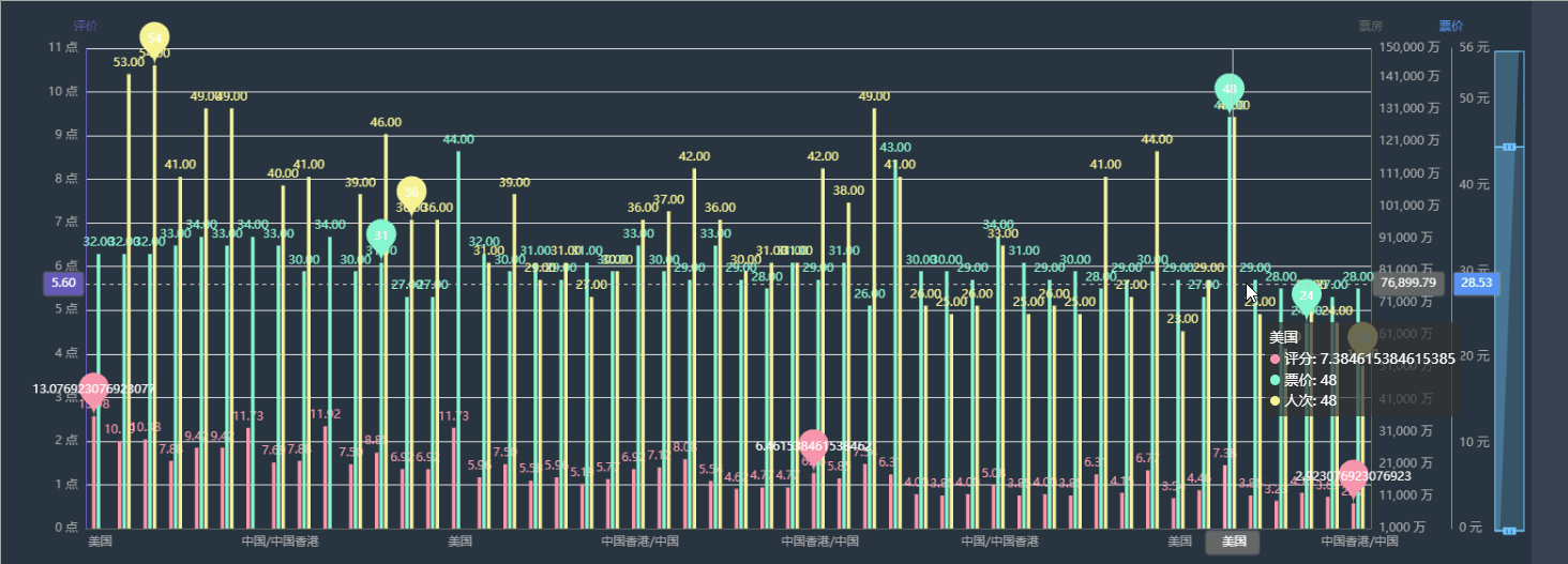
8、多个Y轴
1 2 3 4 5 6 7 8 9 10 11 12 13 14 15 16 17 18 19 20 21 22 23 24 25 26 27 28 29 30 31 32 33 34 35 36 37 38 39 40 41 42 43 44 45 46 47 48 49 50 51 52 53 54 55 56 57 58 59 60 61 62 63 64 65 66 67 68 69 70 71 72 73 74 75 76 77 78 79 80 81 82 83 84 85 86 87 88 89 90 | colors=['#5793f3','#d14a61','#675bba']legend_list=['票房','人次','价格','评价']list1=cnbodfsort['REGION'].tolist()list2=cnbodfsort['PRICE'].tolist()list3=cnbodfsort['PERSONS'].tolist()list4=cnbodfsort['BO'].tolist()list5=cnbodfsort['points'].tolist()c = ( Bar(init_opts=opts.InitOpts(theme=ThemeType.CHALK,width="1600px",height="600px")) .add_xaxis(list1) .add_yaxis("评分", list5,yaxis_index=0,category_gap="50%",color=colors[2]) .add_yaxis("票价", list2,yaxis_index=0,category_gap="50%",color=colors[0]) .add_yaxis("人次", list3,yaxis_index=0,category_gap="50%",color=colors[1]) .set_series_opts( label_opts=opts.LabelOpts( position="top", formatter=JsCode( "function(x){return Number(x.data).toFixed(2);}" ), ), markpoint_opts=opts.MarkPointOpts( data=[ opts.MarkPointItem(type_="max", name="最大值"), opts.MarkPointItem(type_="min", name="最小值"), opts.MarkPointItem(type_="average", name="平均值"), ] ), ) .extend_axis( yaxis=opts.AxisOpts( name="票房", type_="value", min_=1000, max_=150000, interval=10000, position="right", axislabel_opts=opts.LabelOpts(formatter="{value} 万") ) ) .extend_axis( yaxis=opts.AxisOpts( name="评价", type_="value", min_=0, max_=11, interval=1, position="left", axislabel_opts=opts.LabelOpts(formatter="{value} 点"), axisline_opts=opts.AxisLineOpts( linestyle_opts=opts.LineStyleOpts(color=colors[2]) ), splitline_opts=opts.SplitLineOpts( is_show=True,linestyle_opts=opts.LineStyleOpts(opacity=1) ), ) ) .set_global_opts( yaxis_opts=opts.AxisOpts( type_="value", name="票价", min_=10, max_=70, position="right", offset=80, axisline_opts=opts.AxisLineOpts( linestyle_opts=opts.LineStyleOpts(color=colors[0]) ), axislabel_opts=opts.LabelOpts(formatter="{value} 元"), ), tooltip_opts=opts.TooltipOpts(trigger="axis", axis_pointer_type="cross"), datazoom_opts=opts.DataZoomOpts(orient='vertical'), toolbox_opts=opts.ToolboxOpts(pos_left='120%'), legend_opts=opts.LegendOpts(is_show=False), ) )line = ( Line() .add_xaxis(xaxis_data=x_data) .add_yaxis( series_name="票房", yaxis_index=1, y_axis=list4, label_opts=opts.LabelOpts(is_show=False), ))c.render_notebook() # 直接在代码区域展示图片 |
双Y轴:
9、直方图 Bar - Bar_histogram
1 2 3 4 5 6 7 8 9 10 11 12 13 | # Bar - Bar_histogramfrom pyecharts.options.global_options import ThemeTypefrom pyecharts import options as optsfrom pyecharts.charts import Barfrom pyecharts.faker import Fakerc = ( Bar({"theme":ThemeType.DARK}) .add_xaxis(cnboregiongb.index.tolist()) .add_yaxis("数量", cnboregiongb.values.tolist(), category_gap=0, color=Faker.rand_color()) .set_global_opts(title_opts=opts.TitleOpts(title="Bar-直方图")))c.render_notebook() |

以上就是Python pyecharts绘制条形图详解的详细内容
原文链接:https://blog.csdn.net/wxfighting/article/details/123597940